Case 04 · Helix Building OS · 2026
Role
Senior Product Designer
Timeline
4–8h brief · 7h used
Platform
Web · Configuration Console · Responsive Design
Domain
Facilities · Enterprise IAM
Team
Solo · for SSH Communications Security
↓ Scroll — the work
Views, one mental model
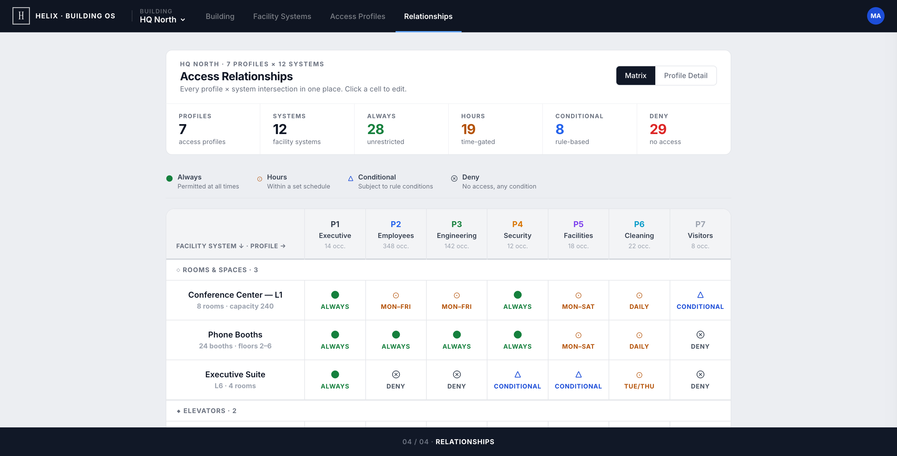
Building · Facility Systems · Access Profiles · Relationships
Profile × system rules
4-mode access grammar: always · hours · conditional · deny
Rule object across surfaces
Matrix edits and profile edits are the same write — no sync to break
SSH Communications Security develops privileged-access products for regulated enterprise IT. The take-home asked: design a configuration experience for a new building-management product line — one surface that models rooms, elevators, HVAC, water supply, and sanitation, with profile-based access governance on top. The constraint that mattered most: don't oversimplify. Facility teams need every capability the legacy vendors expose — they just shouldn't have to learn five mental models to get there.
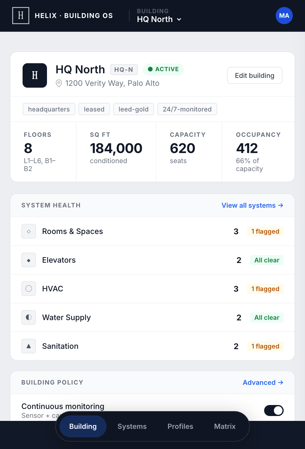
Situational awareness first — edits second. Every screen opens with a white card that names the context and surfaces the key counts. Identity, then health, then policy, then edits. Never the reverse.
Identity, health, policy — in that order
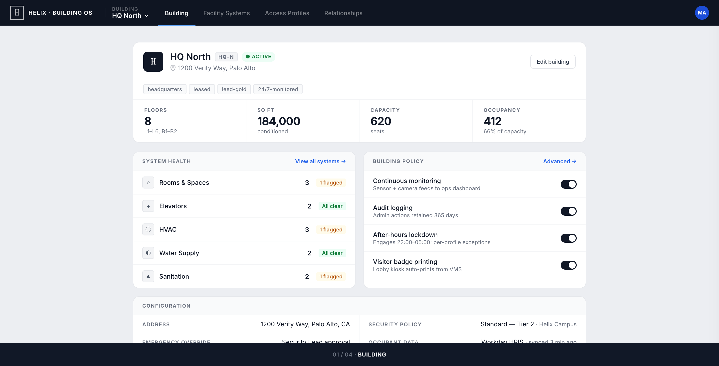
The selected building (HQ North) is rendered as a record, not a landing page. A compact identity row anchors the screen — name, code, status pill, address — then a KPI strip (floors, sq ft, capacity, occupancy) frames the building at a glance.
System Health appears before Building Policy: the admin's first question — "is anything broken?" — is answered before they face decisions. The building dropdown carries each campus's state inline so swapping buildings never hides a warning, even before selection.
Status on the card, depth behind Configure
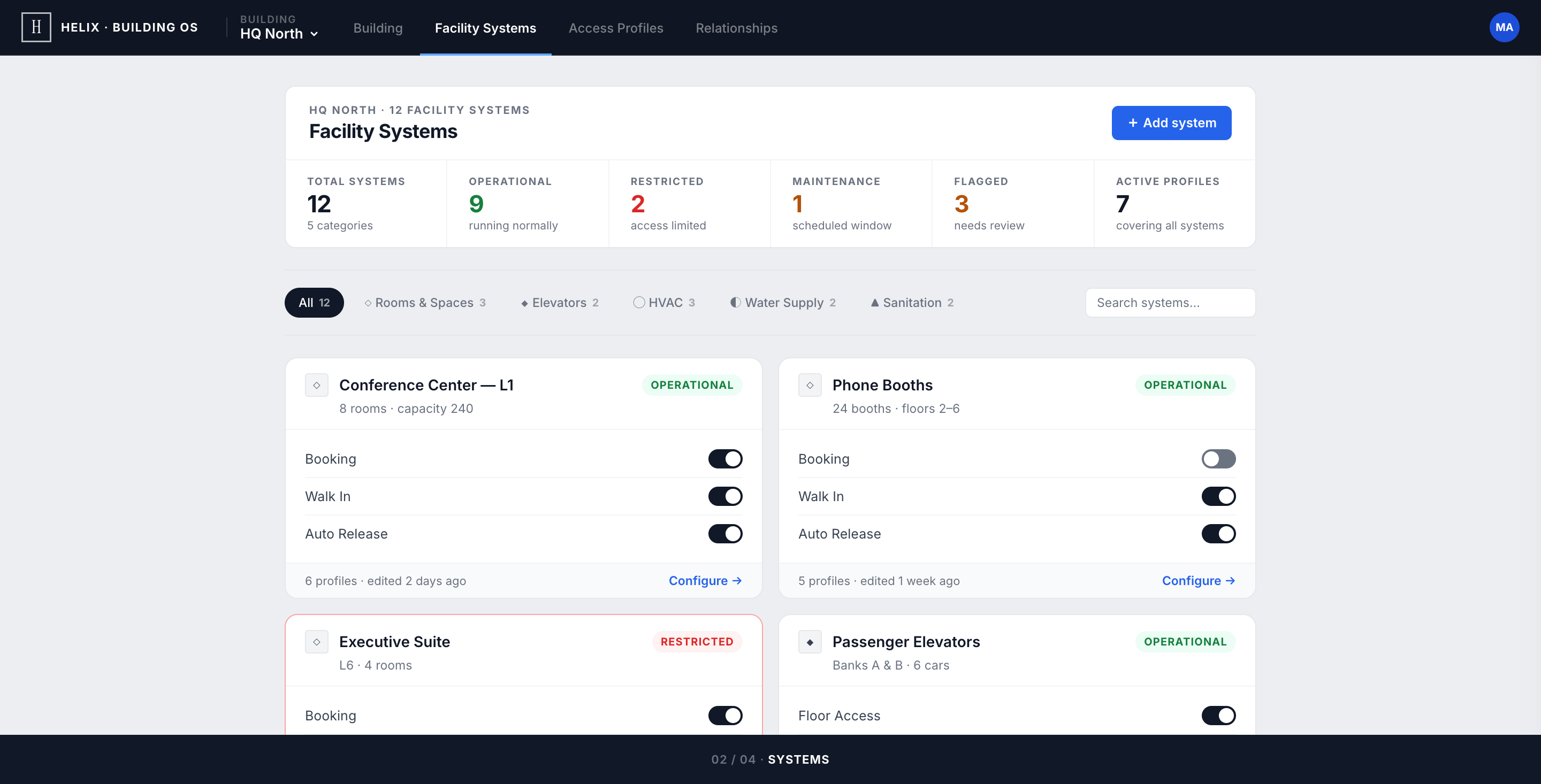
Every controllable thing in the building — a conference centre, an elevator bank, an HVAC zone — surfaces as the same card. Operational, Restricted, and Maintenance render on the card face, so a routine status audit is a scroll, not a series of opens.
The five-filter bar shows live counts inline — a lightweight inventory check (HVAC shows 3 but you expected 4? something's missing). Type-specific depth (HVAC temperature limits, elevator priority modes, sanitation hazardous flags) stays exactly one click away, behind Configure →.
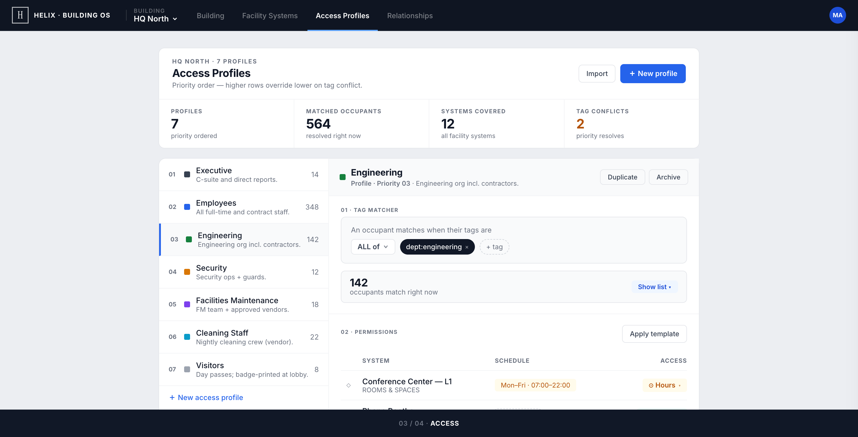
Profile as a record. Match count as trust signal.
Seven access profiles — Executive, Employees, Engineering, Security, Facilities, Cleaning, Visitors — each rendered as a compact identity row: 10×10 colour swatch, name, priority chip, one-line description. No editorial framing, no big swatch blocks — dense identity, zero overhead.
The hardest detail to get right: the match count. Each profile shows the live number of occupants whose current tags resolve to its rules. Zero matches is a silent failure — either locking everyone out or granting access to nobody — so the count had to be the first thing an admin sees, glance-readable without opening anything.
Two views, one rule object
The matrix flips Access Profiles on its side: rows are facility systems, columns are profiles, cells are the access state. A coverage strip across the top counts Always / Hours / Conditional / Deny across the entire building — over-restriction or over-permission shows up before the admin scrolls to any cell.
Click any cell: an inline picker with four options appears. Hours opens the schedule editor anchored to that exact cell — pick days and a time window without leaving the matrix. An edit here is the same edit in Access Profiles — one rule object, two render surfaces. No duplicate state to manage, no sync to break.
Card-header + stats-strip is the spine of every view
A white identity card on top, a context strip of counts below it. Building, Facility Systems, Access Profiles, Relationships — all four views inherit the same anchor. The admin learns the shape once.
Resting state is a complete answer
Status, restriction, last-edited, profile reach, match counts — all visible without opening anything. Hover is for affordance, never for truth. Audit-grade legibility means the resting view defends itself.
Vocabulary before chips
Permissions resolve to four words: always · hours · conditional · deny. Four words, four chips, one mental model across the whole matrix. Every "obvious" alternative I tested (allow/restrict/schedule/temporary) collapsed under the seven-profile load.
One rule object, two render surfaces
Matrix edits and Profile edits are the same write. The reading order differs ("who can touch HVAC?" vs "what can Cleaning reach?") but the underlying data is identical. No sync layer, no drift, no duplicate validation.
Match count must be trustworthy first
If the live occupant count for a profile is wrong, an admin will lose faith in automation forever and revert to manual overrides. That number was the single most validated element in the prototype — colour, weight, placement, refresh cadence all designed around the trust signal.
Five vendor models, one matrix
HVAC controllers expose temperature limits and occupancy modes. Elevators expose floor-access and after-hours rules. Sanitation has hazardous-flag and safety-lock semantics. The brief was to design one mental model a facility admin can hold — without losing the per-system depth.
Permissions that aren't binary
"Access" isn't allow/deny in a real building. A cleaning crew needs hours-only. A security lead needs conditional on incident. The matrix had to express four modes without becoming a colour-coded spreadsheet.
Multi-building cognitive load
A campus operator manages four+ buildings with different policies. The console has to make "you are configuring HQ North" structurally obvious — and the building dropdown has to carry each campus's state so swapping never hides a warning.
Audit-grade legibility
SSH's market is regulated enterprise. Every config change must be defensible at audit. The visual language couldn't hide state behind hover or animation; the resting view had to be a complete answer.
Each view inherits the same identity-card + stats-strip anchor — situational awareness before edits, every time.
01 · Building — Identity & Health
HQ North as a record. Identity row, KPI strip (floors, sq ft, capacity, occupancy), then System Health before Building Policy. The first question — 'is anything broken?' — is answered before any toggle.
Full responsiveness in the same operational grammar — rendered in a tablet-native rhythm instead of being mixed into the desktop showcase.
Lesson 01
Anchor before pixels
Naming the shared anchor — white card + stats strip — before sketching any view forced every screen to either honour that anchor or kill it. The pattern is invisible to the user; it's the load-bearing wall for the designer.
Lesson 02
Permission UX is a vocabulary problem
The hardest decision wasn't visual — it was settling on always · hours · conditional · deny as the only four words allowed. Vocabulary first; chips after. Settling the language costs less time than redesigning the chips three times.
Lesson 03
Trust signals deserve their own brief
The match count on each profile is one number — but it's the single number that decides whether an admin trusts the automation. Treating it as a feature in its own right (placement, weight, refresh, behaviour at zero) was the highest-leverage hour of the brief.